Customizing your map
Change the map style, pin colors and icons, and what shows in the record cards.
Your map settings give you full control over how your public map looks and behaves. Open any map from the dashboard, then click the pencil icon on the row to reach its settings, or navigate directly to Maps in the sidebar and click the pencil icon on the map you want to edit.
The settings are organized into six sections in the left rail: General, Appearance, Pins, Filters, Display, and Sharing. This article covers the sections that most affect how your map looks and filters.
Set the overall look with Appearance
The Appearance section controls your map's theme, basemap style, and brand color.
- Go to Maps in the dashboard sidebar.
- Click the pencil icon on the map you want to edit.
- In the left rail, click Appearance.
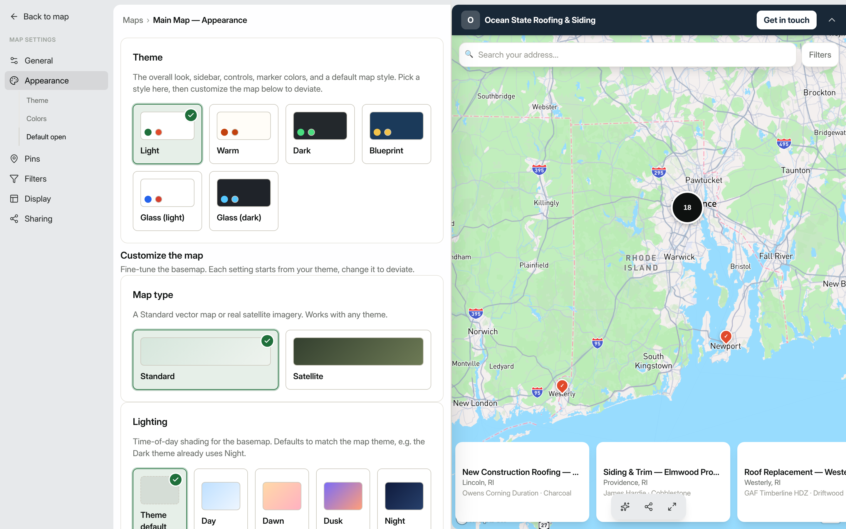
Theme picks the overall design: sidebar style, control colors, and a default map style. The available themes are: Light, Warm, Dark, Blueprint, Glass (light), and Glass (dark). Click any swatch to preview the change live in the preview panel.
Under Customize the map you can fine-tune the basemap independently of the theme:
- Map type: choose Standard (a vector road map) or Satellite (real aerial imagery).
- Lighting: set a time-of-day look: Theme default, Day, Dawn, Dusk, or Night.
- Basemap tint: leave it at Theme default, or apply Faded (quiets the map behind your pins) or Monochrome (desaturates it).
- Map labels & detail: toggle Place names, Street names, Points of interest, and 3D buildings on or off.
The Logo card lets you upload an image that appears as a banner at the top of your public map. PNG with a transparent background works best.
The Brand color card sets the primary accent used for header backgrounds, lead-capture buttons, and the active record highlight. You can pick from the color swatch or type a hex value directly.
Click Save when you're done.
Control pin colors and icons
The Pins section lets you change what your map pins look like and how location privacy is handled.
- In the same map settings left rail, click Pins.
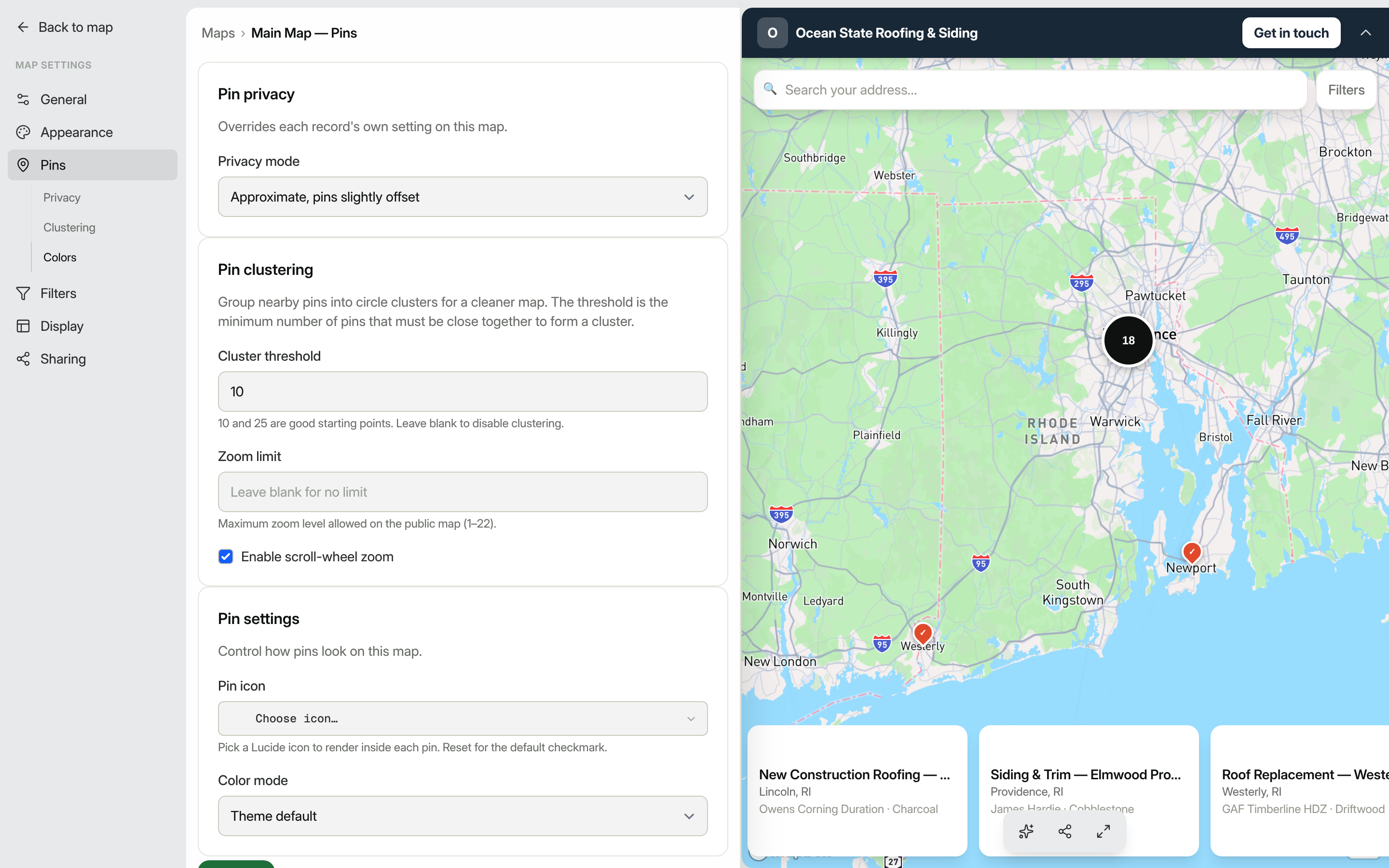
Pin privacy lets you override how precisely addresses are shown:
- Approximate (pins slightly offset)
- Exact (true pin locations)
- City only (snapped to city center)
Pin clustering groups nearby pins into circle clusters when many records are close together. Set a Cluster threshold (the minimum number of pins needed to form a cluster: 10 or 25 are good starting points) and an optional Zoom limit to cap how far visitors can zoom in. You can also uncheck Enable scroll-wheel zoom if you don't want the map to zoom when visitors scroll the page.
Pin settings has two controls:
- Pin icon: choose a Lucide icon to render inside every pin. Click Reset to go back to the default checkmark.
- Color mode: a dropdown with four options:
- Theme default: pins use the marker color defined by your chosen theme.
- Uniform color: every pin gets one color you pick with the color swatch.
- By field value: pins inherit colors you have already assigned to individual field options (only available when at least one multiselect field has option colors set up).
- Conditional rules: define rules in order; the first matching rule's color and icon are used. Each rule gets its own pin color, an optional pin icon, and a condition built from your record fields.
Click Save to apply your changes.
Choose how record details display
The Display section controls what visitors see after clicking a pin and how records are listed.
Result display sets the layout used when a visitor opens a record:
- Modal: a centered dialog over the map.
- Drawer: a tall panel that rises from the bottom.
- Sidebar: a slim panel pinned to the right, keeping the map in view.
- Card: a compact corner card that links to the full record page.
List display controls how records appear in the map's record list panel:
- Full-width image: large image above the title and details.
- Small left image: a thumbnail alongside the title.
- No images: text only, the most compact layout.
Click Save after making your selection.
Tip: Changes to Appearance and Pins update a live preview alongside the settings form, so you can see the effect before saving.
Control which filters appear on your map
The Filters section in the map settings left rail lets you choose which custom fields appear as filter controls on your public map and how they behave.
- In the map settings left rail, click Filters.
- Each field marked Filterable on your record type appears as a row here. Toggle a field off to remove it from the public filter panel without changing the field itself.
- Click Save to publish your changes.
Filters auto-generate based on field type: Select and Multi-select fields produce checkbox lists; Date fields produce date pickers; Number and Rating fields produce a numeric filter control. Visitors see only the filter controls you leave enabled here.
Advanced number and rating filters
When a visitor opens a Number or Rating filter on your public map, they can choose from a full set of comparison operators rather than just a range. The available operators are:
| Operator | Behavior |
|---|---|
| is | Matches records where the field equals the value exactly |
| is not | Matches records where the field does not equal the value |
| greater than | Matches records where the field is above the value |
| greater than or equal | Matches records at or above the value |
| less than | Matches records below the value |
| less than or equal | Matches records at or below the value |
| between | Matches records within a lower and upper bound (inclusive) |
| is empty | Matches records where the field has no value |
| has any value | Matches records where the field is not empty |
You choose the operator from a dropdown next to the value input. For between, a second value field appears for the upper bound.
Saved maps that used the older range-style filter continue to work without any action on your part.
Searching within a long option list
When a Select or Multi-select filter has many options, a search box appears at the top of the filter panel. Type a few letters to narrow the list to matching options. Selecting an option from the filtered list works the same as clicking it in the full list.
Hide parts of the map
The Filters settings also include a Map chrome card that turns whole pieces of the public map on or off. Each toggle is on by default:
- Branded header: the bar at the top with your logo and name.
- Record list: the sidebar of records (and its mobile reel), leaving only the map and its pins.
- Search: the address and text search box.
- Filters: the filter chips and facets.
Turning these off is most useful for an embedded map on a page that already has its own header, search, or list. You can set these defaults here and still override them per embed with the JavaScript SDK.
Set the lead button label
By default, the button on each record's detail reads Get in touch. To change it (for example to View details or Book now), open the map's General settings and edit Lead button label.
The neighboring Lead button link controls where that button goes. Leave it blank to open the built-in lead form, or enter a URL to send visitors to your own page instead. The URL accepts {slug} and {id} placeholders that are filled in with the selected record, so https://example.com/listings/{slug} deep-links each pin to its own page on your site.